Module 15: ASEAN Food Production and Supply
Table of Contents
Language Focus
Language Focus 4: Describing graphs and charts
Line graphs and bar charts offer meaningful representation of information. They can leave a lasting impression on an audience and offer comparison of quantified data to make an interesting presentation. As a result, the audience’s attention is captured and directed towards the information.
In doing business, instead of using a series of figures and statistics, choosing the right sort of graphs helps to reveal trends.
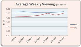
1) Line graphs illustrate a trend over time.
|
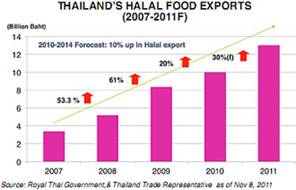
2) Bar charts illustrate patterns or information about frequency.
|
Parts of bar charts

Reading Charts
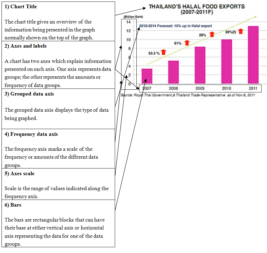
Each element of a bar graph gives an overview of presented information (using the graph above).
| 1. Chart title provides an overview of the type of information given in the bar graph. For the bar graph given, the title indicates data on: Thailand’s Halal Food Exports. |
2. Axes and labels tell information on each axis. One axis represents data groups in labeled years. The other axis is labeled export values. |
3. Bars are rectangular blocks that have their base at either the vertical axis or horizontal axis. In this case, the base of the bars is on the horizontal axis. This means that the grouped data axis is the horizontal axis and the frequency axis is the vertical axis. |
4. Vertical axis is the frequency axis and contains the quantity demanded given in units of billion baht. |
5. Grouped data axis is always at the base of the bars, the grouped data axis is the horizontal axis. The axis label tells that along the horizontal grouped data axis shows year (2007-2011). |
6. Frequency data axis is the range of frequency values shown on the graph. The span of values represented is determined by the lowest and greatest values. For this graph, the frequency scale ranges from 0 to14, and uses an interval of units of 2 billion baht. |
Describing charts or graphs
Doing an overview of the titles of the table and axes may take more practice. They determine the type of data groups being presented, whether the scale is appropriate, and making comparisons between groups of data. Here is the information that should be included:
1. structure |
Your paragraphs include introduction, body and conclusion. Your paragraphs include connective words to make the writing cohesive within sentences and paragraphs. |
2. grammar and vocabulary |
Your paragraphs include a variety of sentence structures. Your paragraphs include a range of appropriate vocabulary. |
3. requirements of the task
|
Your paragraphs meet the word limit requirements. Your paragraphs describe the whole graph adequately. Your paragraphs highlight important trends presented in the graphic information. |
Vocabulary
Movement (up) |
Movement (down) |
Adverbs and intensifiers |
No movement |
Tops and bottoms |
rose |
fell |
slightly |
stabilized |
reached a peak |
went up |
declined |
gradually |
remained stable |
reached bottom |
increased |
dropped |
steadily |
remained constant |
peaked |
grew |
decreased |
gently |
did not change |
reached the highest level |
shot up |
sank |
steeply |
were unchanged |
fell to a low |
surged |
went down |
suddenly |
remained steady |
sank to a trough |
rocketed |
plunged |
sharply |
|
|
NOTE: The verbs are all in the past tense, which is usual as the information has usually been gathered from past events. However, as the information may be in the process of being shown to an audience it might be possible to use the present tense to make it more ‘dynamic’. But be careful as mixing the tenses in a presentation could be confusing. (e.g. “The trend increases steadily.” “The fall reaches bottom here.”) |
||||

